
About This Project
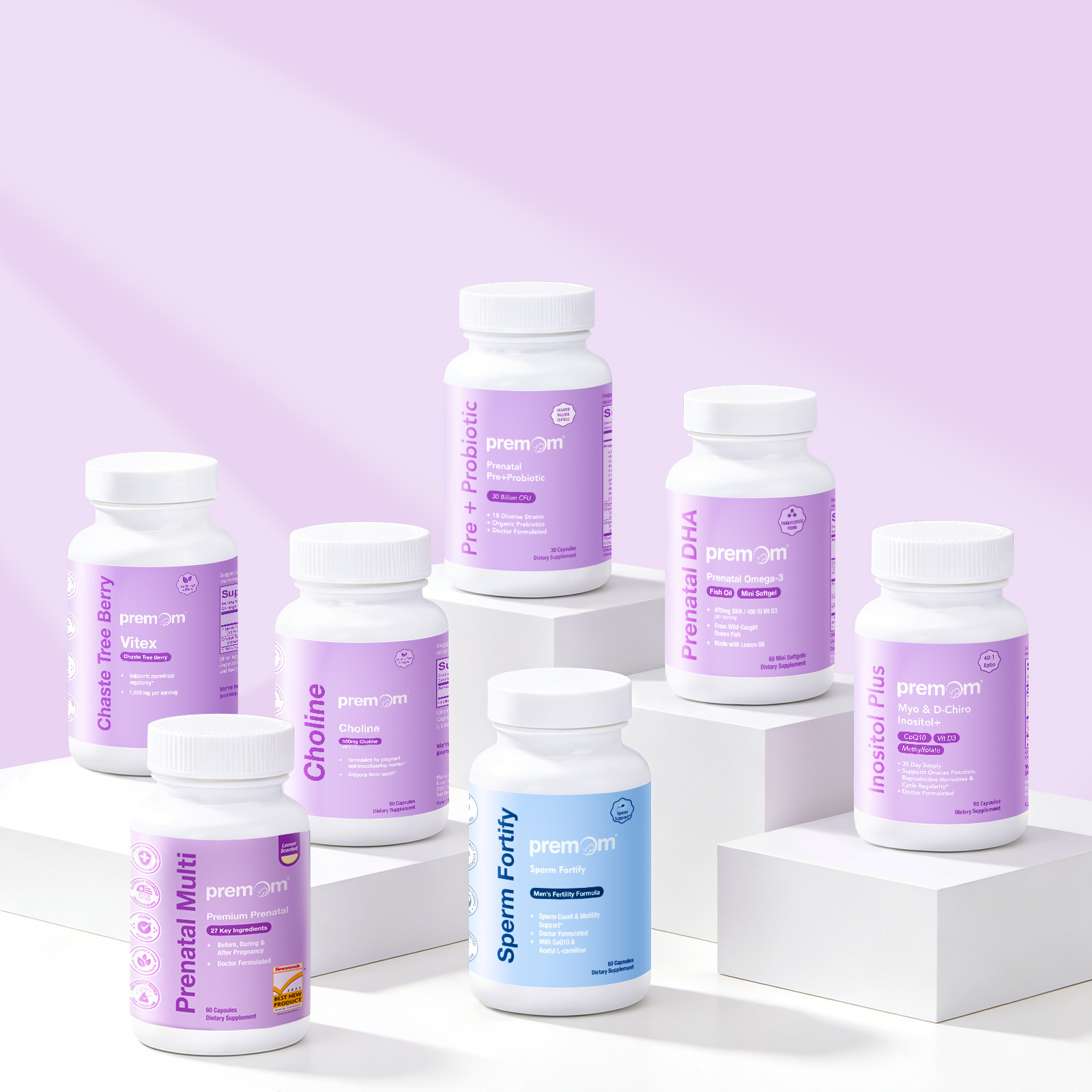
A complete label design system built from scratch for Premom’s supplement line: 14 products across two brands, each balancing dense regulatory content with a small, evolving format.
I designed the complete packaging and label system for Premom’s supplement line from the ground up, covering 14 products in total. This includes our core prenatal and fertility support line (Premium Prenatal Multivitamin, Prenatal DHA, Pre+Probiotic, Inositol, Choline, Vitex, Egg Fortify), men’s health (Sperm Fortify, Men’s Conception Multi), Her Sleep gummies, and a fertility lubricant, plus two products for our sister brand easy@Home (UTI Harmony, MenoPlus). I owned the full pipeline, including concept and layout, Supplement Facts Panel creation and formatting, print ready file prep, and file organization for a line that continues to grow.
The core challenge was information density. Our formulas are ingredient rich by design; the Prenatal Multi alone carries 27 essential ingredients, which makes for an unusually large Supplement Facts Panel competing for space on a small label. That challenge compounded in 2026 when we shifted select products from bottles to jars, shrinking the available label area even further. Rather than solving each label one at a time, I built a label organization system that defines exactly where each type of content lives: brand elements, product name and benefit messaging, SFP, and directions. That structure keeps the hierarchy consistent and legible whether it’s on a full size bottle or a compact jar, and it’s what lets the line keep expanding without losing cohesion.